.svg)
.svg)


For most people, the month falls into two phases - before and after payday - when balances jump, debts feel manageable, and financial intentions come back within reach. But in most banking apps, payday is treated as a passive event. Money arrives, the balance updates, and the customer is left to work out what happens next.
As banks and fintechs compete to become the primary financial relationship, that moment is too important to waste. This week, we explore how designing around payday can help customers make better decisions before their money disappears.
From payday to plan day
Most money management tools are retrospective; they tell users what they spent, where or how their habits compare to previous months. That can be useful, but it often arrives too late.
Payday creates a different kind of opportunity because it is forward-looking. Users have fresh income, upcoming commitments, and a brief window where they can shape the month ahead. Instead of treating income as a line item in a transaction feed, apps can use it as the starting point for a more proactive money experience.
A strong payday experience could help users:
- Split income between bills, savings, spending, debt repayment, and investments
- Forecast how much money is actually safe to spend
- Spot whether upcoming commitments will stretch their balance
- Automate contributions to savings pots or investment accounts
- Pay down high-cost credit before discretionary spending begins
- Access earned wages or salary advances when cash flow is tight
- Build better routines around the one moment of the month when they are most financially engaged
The shift is subtle but important. Instead of asking, “Where did my money go?” the app starts helping users answer, “Where should my money go next?”
Why payday is such a powerful UX moment
Payday has emotional weight; for some it brings relief, for others, anxiety because the money is already spoken for. Either way, it is one of the few recurring financial moments that people notice without being prompted.
That makes it a valuable design moment. Unlike generic nudges, payday-based prompts are naturally contextual. A budgeting reminder on a random Tuesday may feel like noise. A prompt to set aside money for rent, debt, or savings immediately after income arrives can feel timely and useful.
A customer may appear financially healthy when their salary lands, but that balance can be misleading if bills, credit repayments, subscriptions, and rent are about to leave the account. A well-designed payday experience can help translate a headline balance into a more realistic view of available money.
This is where features like bill forecasting, committed spend calculations, and “safe to spend” balances can make a real difference.
The rise of salary-linked products
Salary-linked finance can also move beyond budgeting.
Earned wage access, salary advances, employer-linked savings, workplace pensions, and payroll-integrated financial wellbeing tools all point to the same broader trend: financial products are moving closer to income.
For banks, this matters because salary deposits are one of the strongest signals of primary account status. The account that receives income often becomes the account that controls everyday spending, bill payments, credit decisions, savings habits, and product discovery.
For fintechs, payday can become a relationship-building moment. A product that helps users stretch their salary, avoid overdrafts, save automatically, or smooth cash flow has a reason to be opened every month or week.
But the category also carries risk. Salary advances and earned wage access can help users avoid short-term cash flow problems, but poorly designed experiences could normalise early access to income without addressing the underlying issue: money running out before the next payday.
What good looks like
A compelling payday experience should do more than celebrate the arrival of money. It should help users make decisions while the money is still there.
The strongest examples are likely to combine five design principles.
Clarity: Users need to understand how much of their balance is genuinely available after bills, repayments, and planned commitments.
Timing: Prompts should appear when income lands, not days later when spending has already happened.
Personalisation: A student, a gig worker, a salaried professional, and someone managing debt will not need the same payday journey.
Control: Automation should be easy to edit, pause, reverse, or override. Users should never feel trapped by rules they set months ago.
Progress: The experience should show the cumulative impact of small payday decisions, whether that is debt reduced, savings built, investments funded, or bills covered with less stress.
The UX challenge
There is an obvious commercial temptation here. If payday is when customers have money, it is also when providers may be tempted to push credit cards, investments, premium subscriptions, loans, or marketplace offers.
The most effective payday experiences need to balance product discovery with financial well-being. This is especially important in a cost-of-living environment where many customers are already juggling bills, debt, and short-term cash flow gaps. Payday design has to be careful not to overstate control or make financial pressure feel like a personal failure.
Good UX should reduce cognitive load, not add judgment.
The future payday experience could become a monthly command centre for personal finance.
Imagine opening your banking app on payday and seeing:
“Your salary has arrived. After bills and regular payments, you have £820 available until next payday. You’re on track to save £200 this month. Would you like to move £75 into your holiday pot, repay £50 extra on your credit card, and keep £695 for spending?”
Rather than a balance update, the customer gets a plan grounded in context, helping them to stay ahead.
Best-in-class examples
Penfold - Forecast calculator
Penfold’s forecast calculator broadens the idea of proactive money management from the next pay cycle to the customer’s long-term financial future. Instead of simply showing a pension balance, it helps users understand what that balance could mean in retirement income, how close they are to a target lifestyle, and which small actions could improve the outcome.
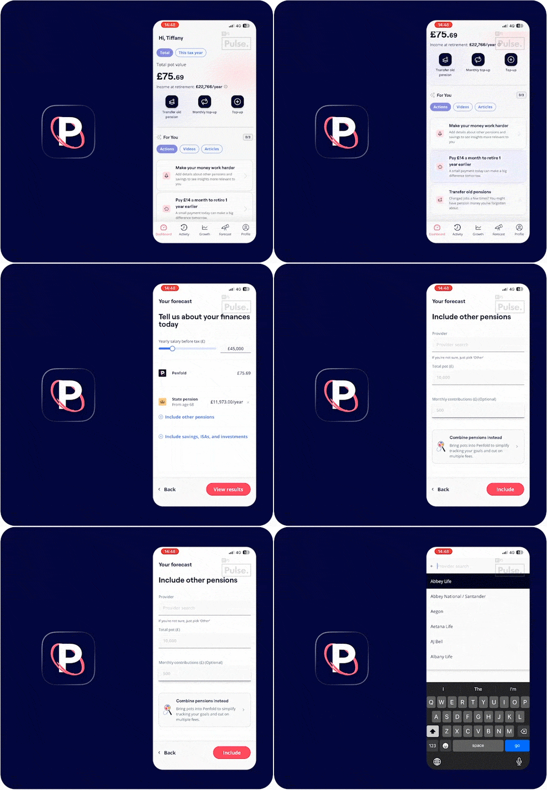
The experience turns abstract pension planning into an interactive forecast, letting users adjust retirement age, salary, contributions, other pensions, savings, and market growth assumptions to see how today’s decisions could compound over time. That makes it a useful example of future-looking UX: it shifts the conversation from “what do I have now?” to “what could this become, and what should I do next?”
By combining projection, personalisation, and clear nudges such as paying a small monthly amount to retire earlier, Penfold shows how financial apps can help users move from passive awareness to confident forward planning.
Chime - Prime early wage access (Premier)
Chime’s MyPay brings the future-looking lens closer to the customer’s immediate cash flow. Rather than waiting for payday to resolve a short-term gap, it shows how much earned income is “available now,” where the user is in the current pay period, and when the next payday is expected.

The experience is clear about the mechanics: the available amount usually grows through the pay period, resets on payday, and is reduced by advances already taken. It also surfaces important guardrails, including outstanding balance, previous advances, instant advance fees, and recent repayment activity, while explaining that fee-free access is available if the user schedules the advance rather than taking it instantly.
In the context of proactive financial UX, MyPay shows how income-linked products can help users manage the days before payday, but it also highlights the design responsibility in this category: early wage access needs transparency, pacing, and clear repayment context so it supports cash-flow smoothing without encouraging repeated dependency.
Best-in-class user experiences, at your fingertips
11:FS Pulse gives you access to over 24,000 handpicked user journeys, including those we've shared above, from 900+ brands worldwide - a live, visual library of what’s working in digital banking today. Stay ahead of competitors, spot emerging trends, and cut your product research time by up to 90% - just ask Monzo.
Book your demo with our experts at 11fs.com/pulse and see what you’ve been missing.